

Coppermill Kitchenware
Project challenge
The goal of this comprehensive creative project was to celebrate Coppermill Kitchen’s heritage & craftsmanship across the rhythm of the seasons.
Our focus was on showing how each hand-forged copper piece transcends time, adapting to the shifting hues, textures, and ingredients of the year.
The imagery invites the viewer to rediscover copper as a living material: warm, luminous, and deeply connected to the changing light and rituals of home.
Creative Approach
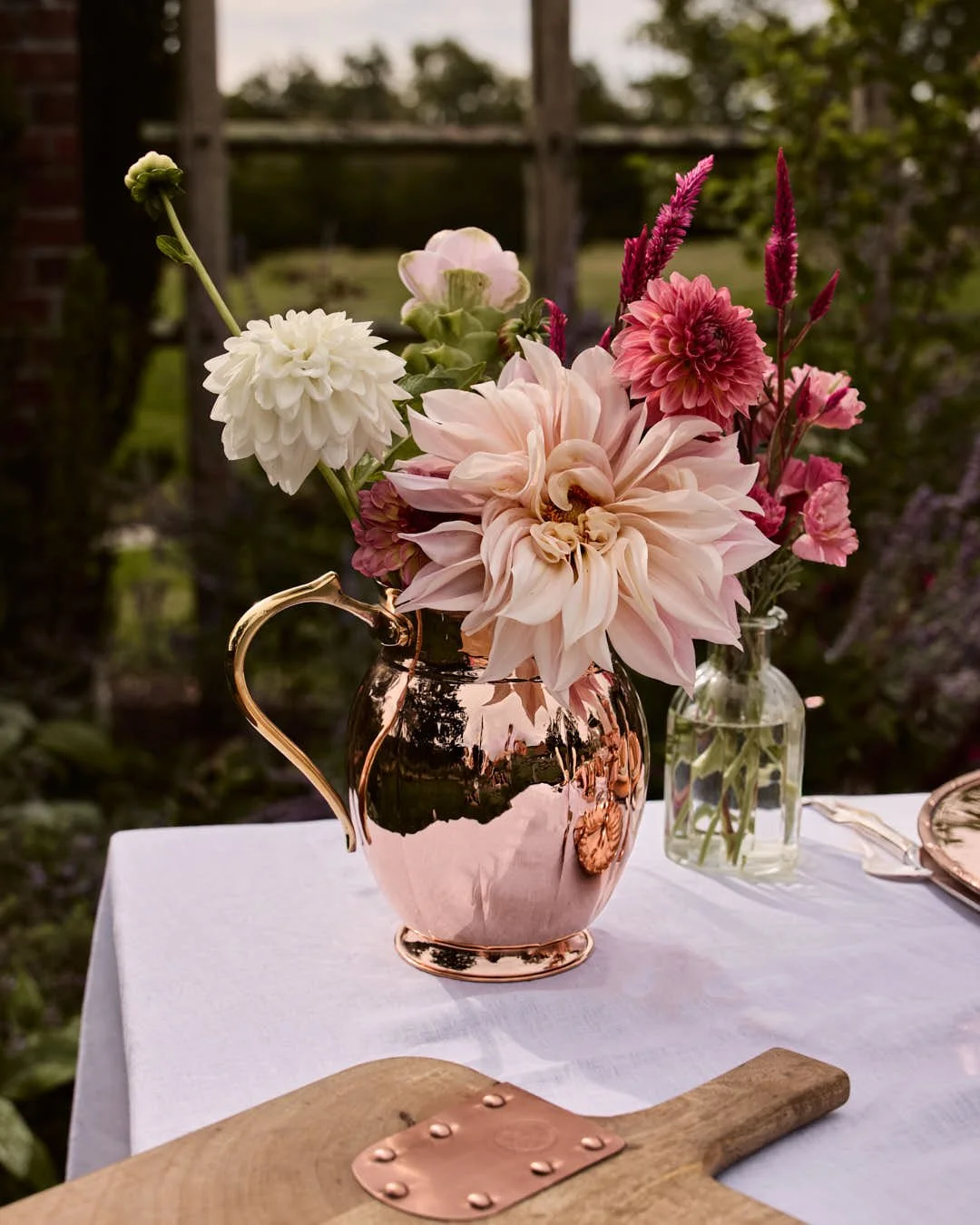
This series captures a year told in copper: from spring’s tender renewal to winter’s quiet glow.
Each season is expressed through light, colour, and texture:
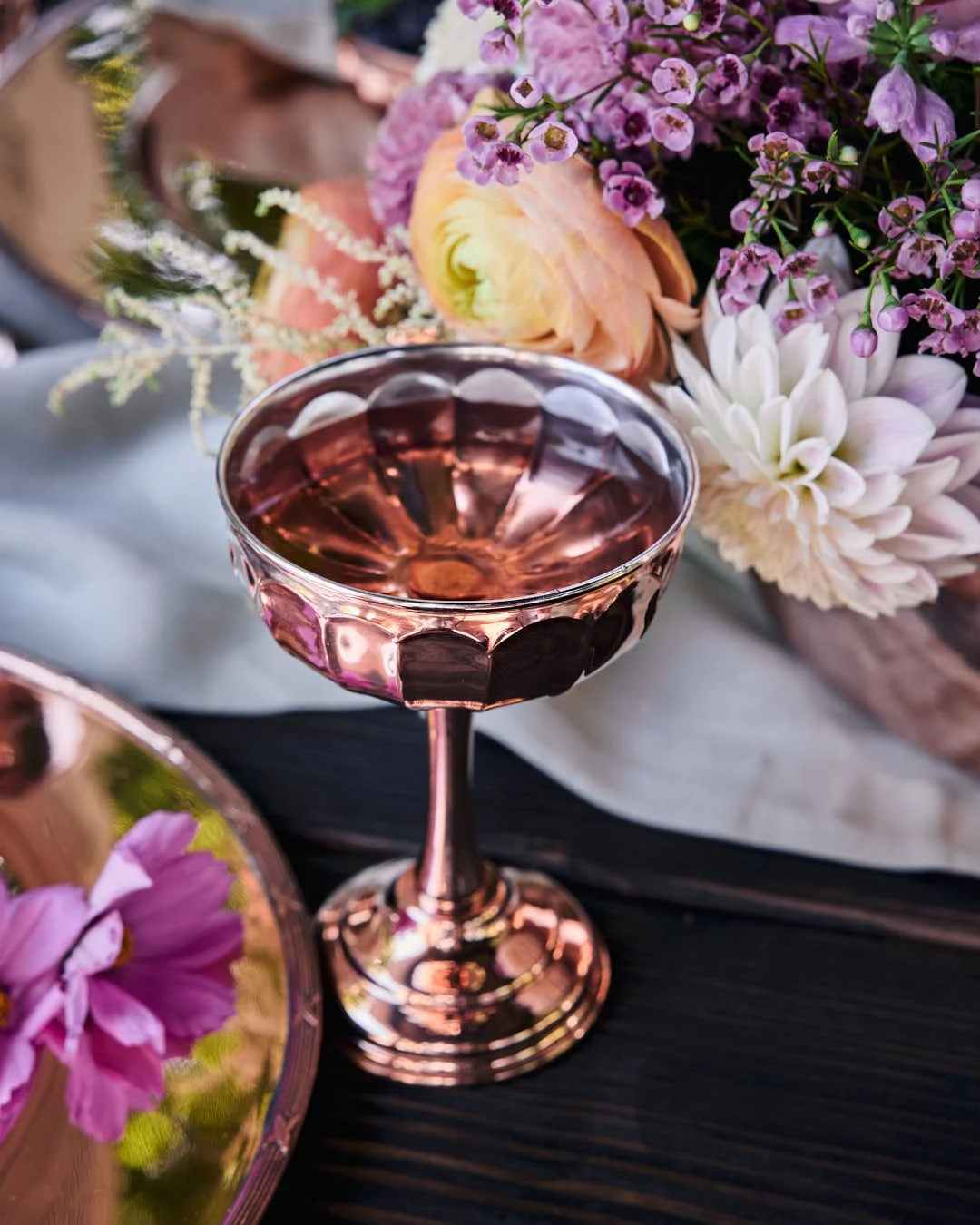
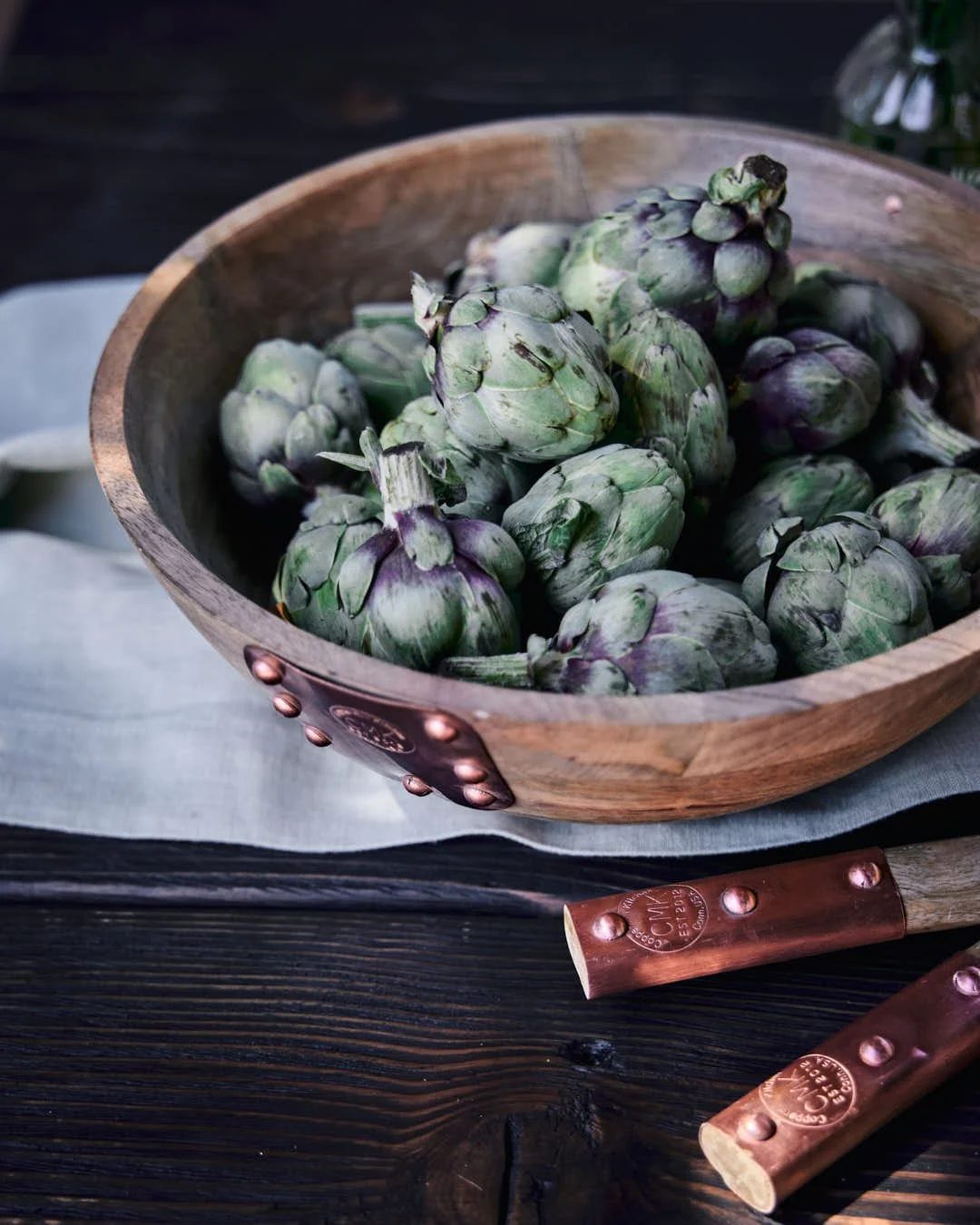
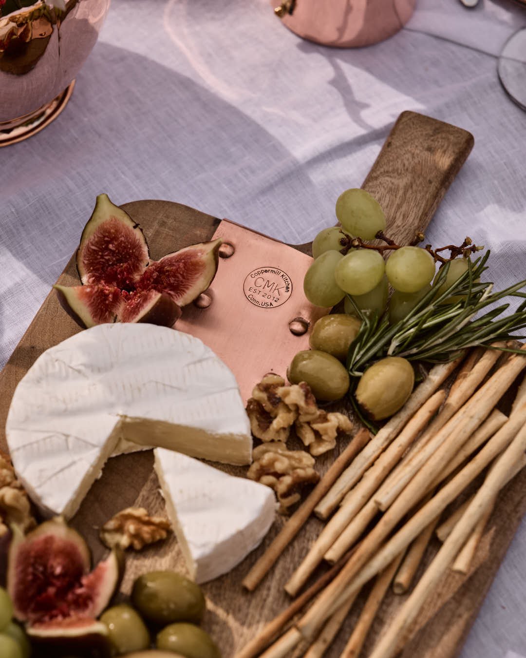
• Spring – Fresh light, early blooms, the crisp green of new growth. A table dressed in renewal and simplicity, with lemons, artichokes, and soft linens.
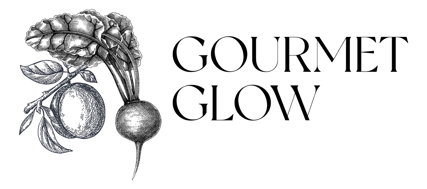
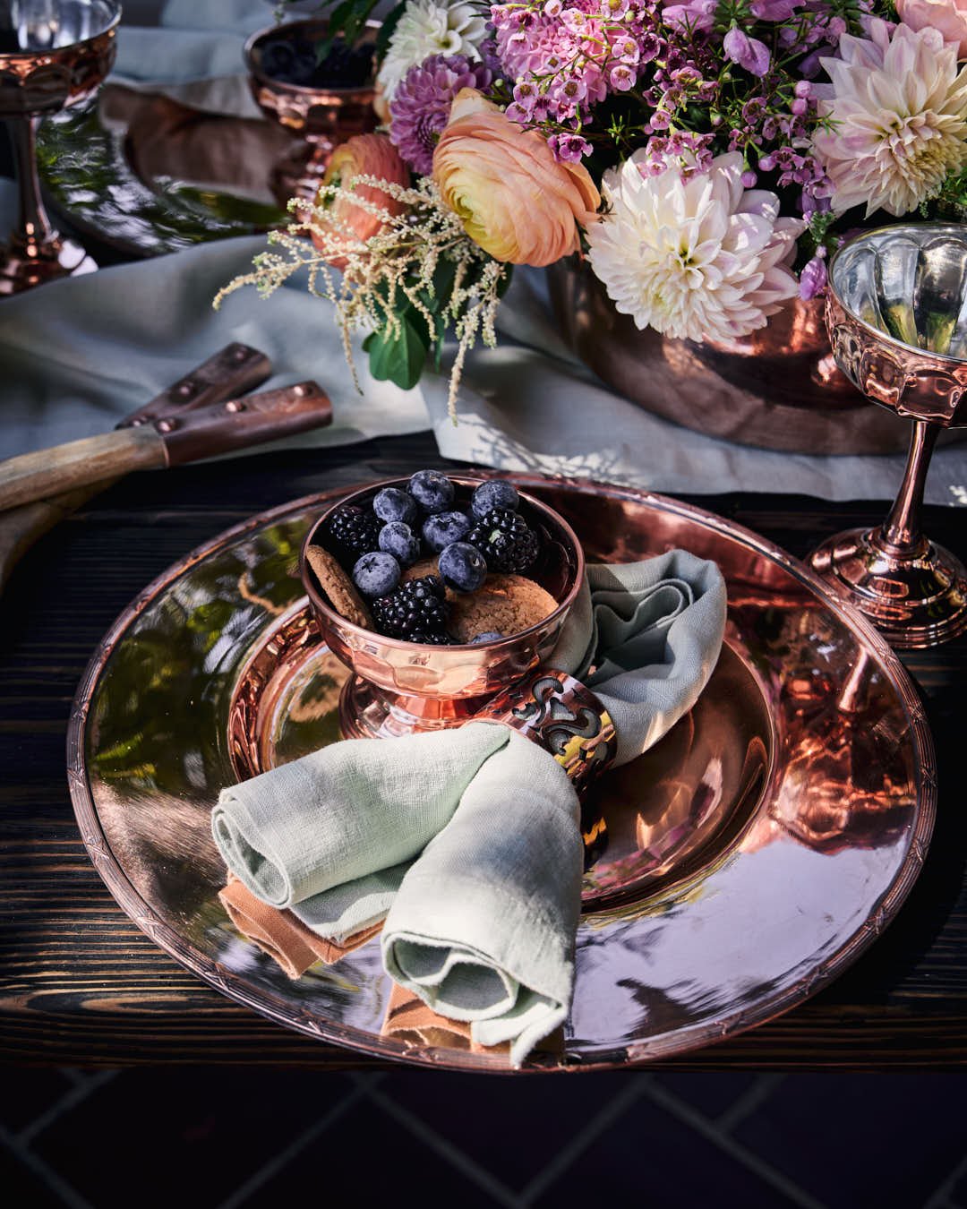
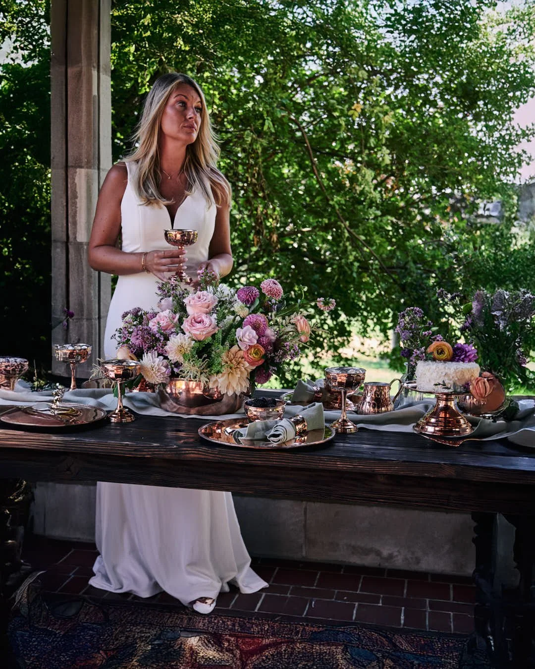
• Summer – Alfresco gatherings in golden light; copper gleaming under sun-dappled shade.
The abundance of seasonal produce and radiant tableware that sparkles in celebration.
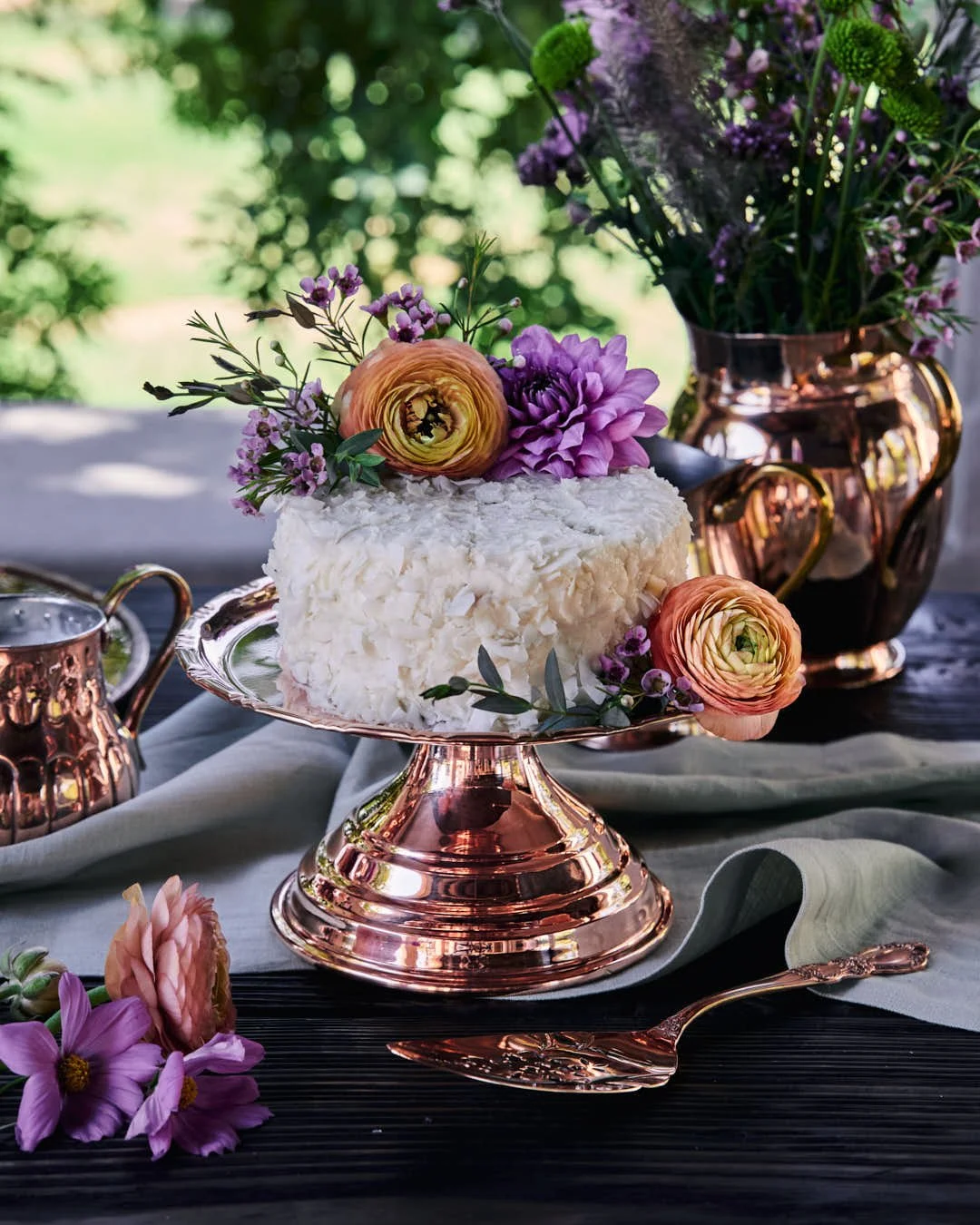
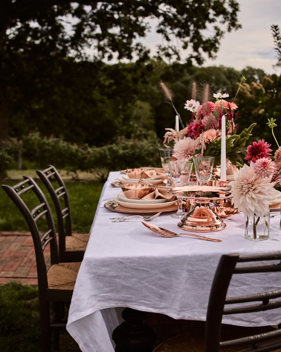
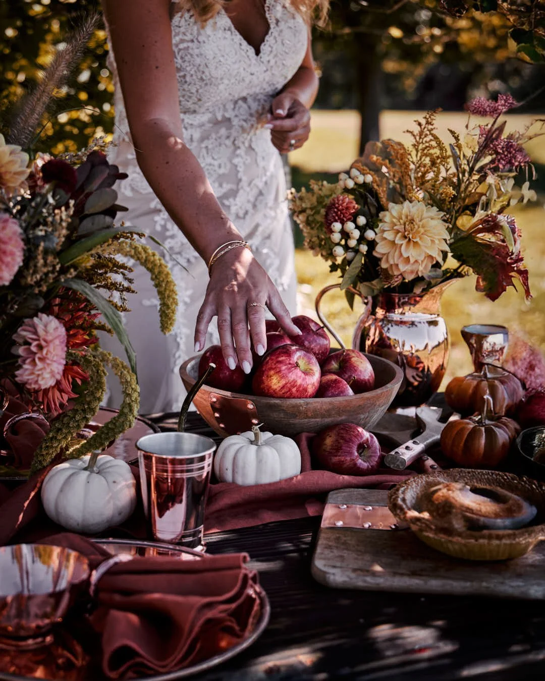
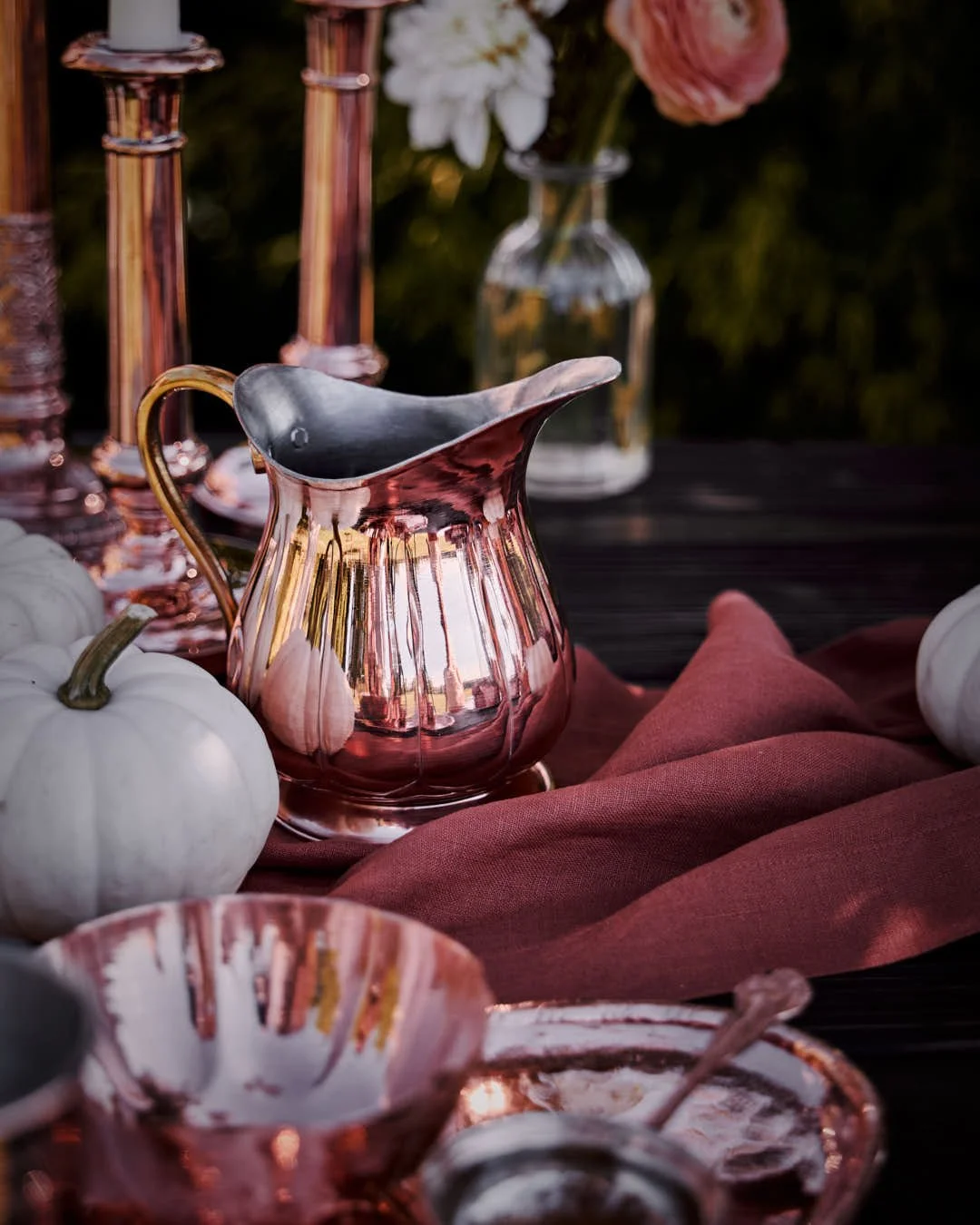
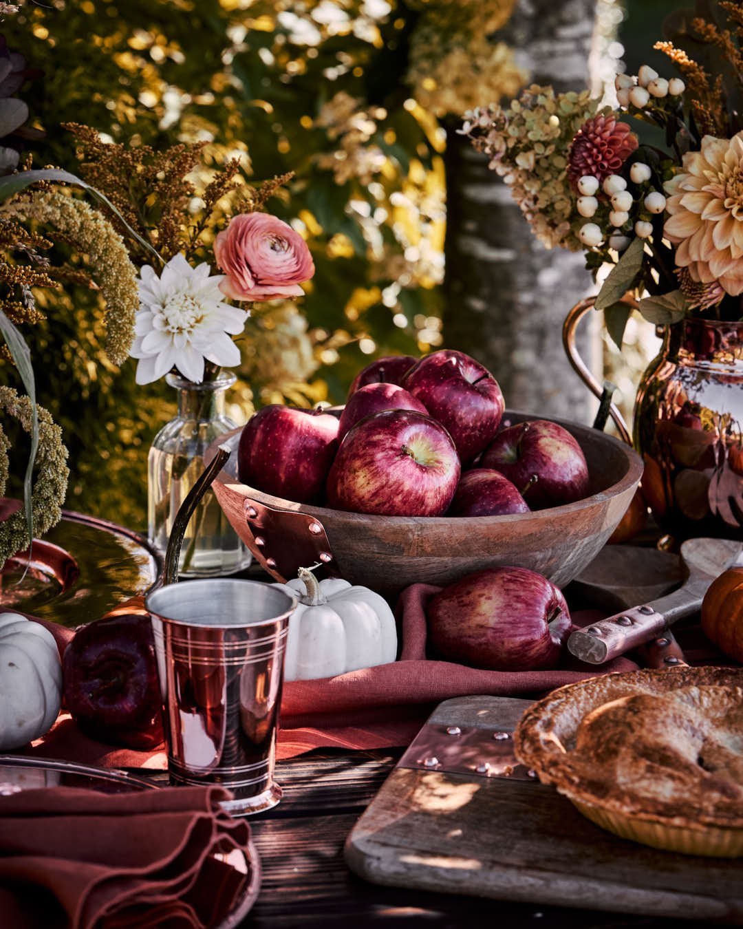
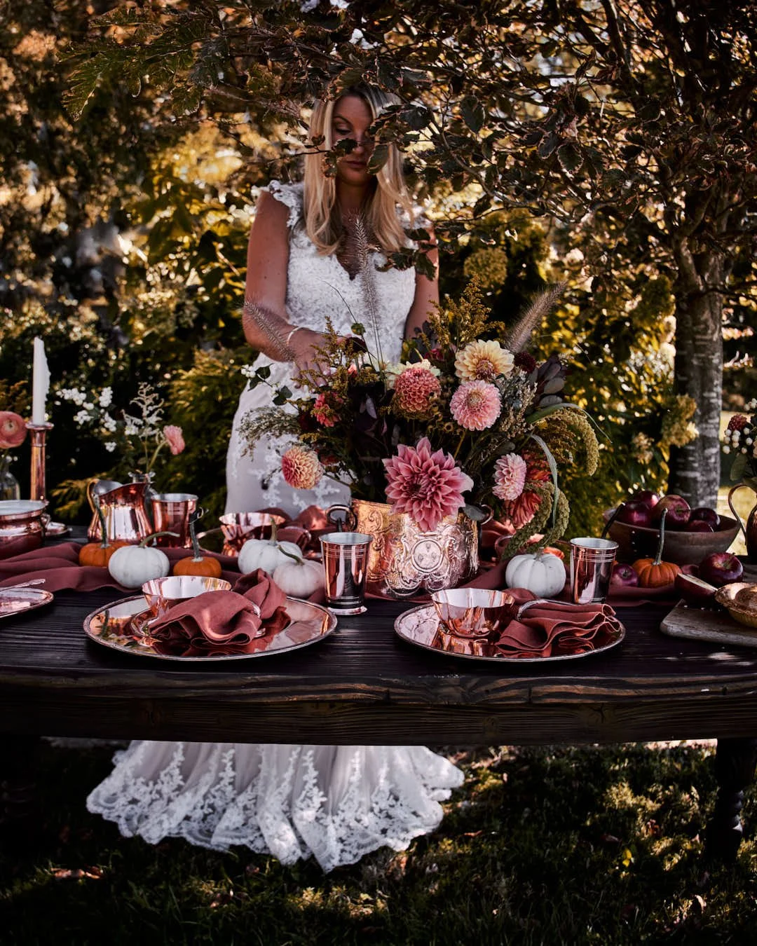
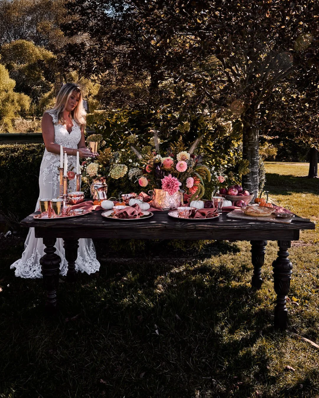
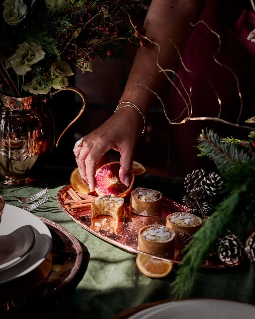
• Autumn – Deeper tones, amber light, copper harmonising with harvest hues.
A sensory ode to warmth, woodsmoke, and generosity.
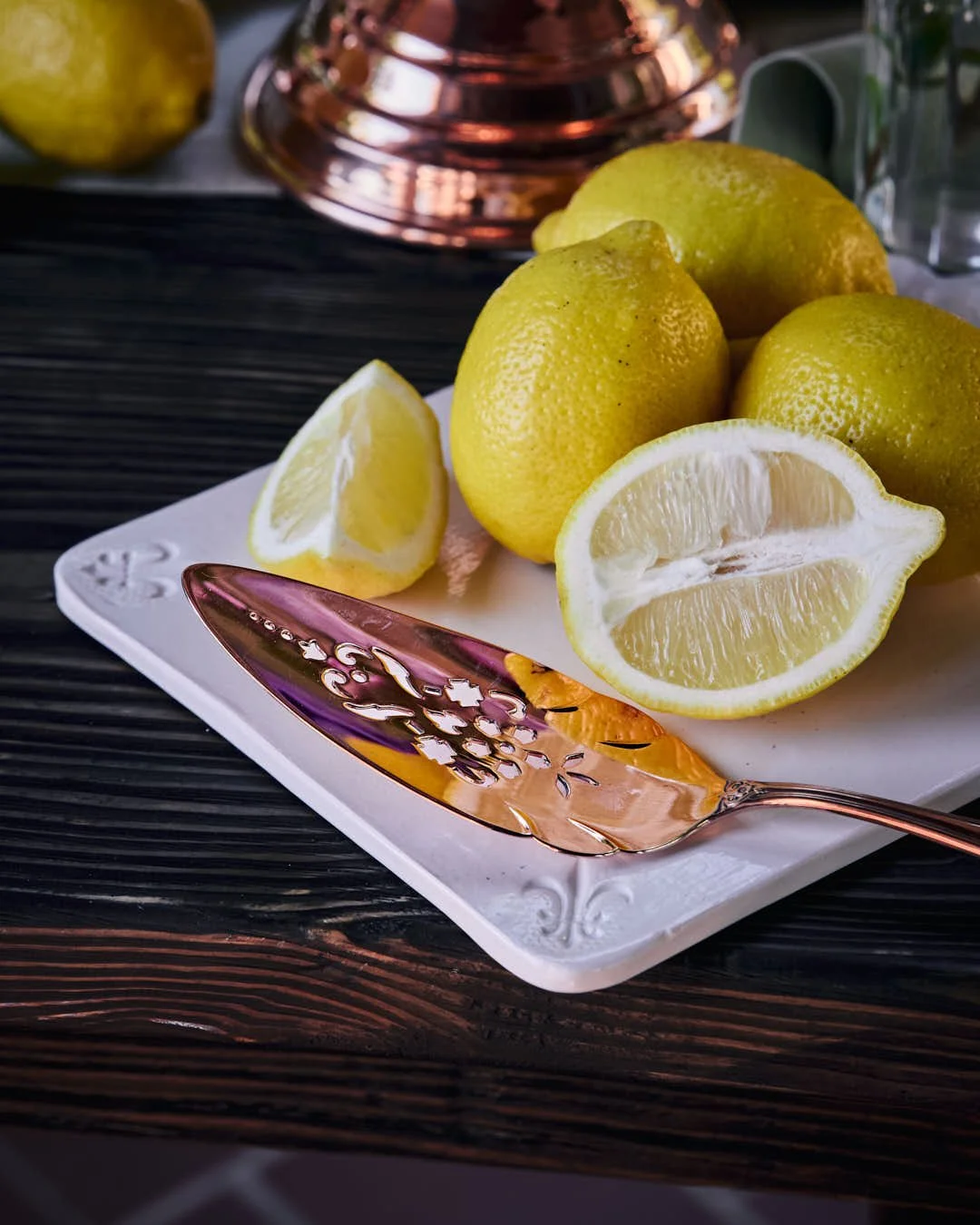
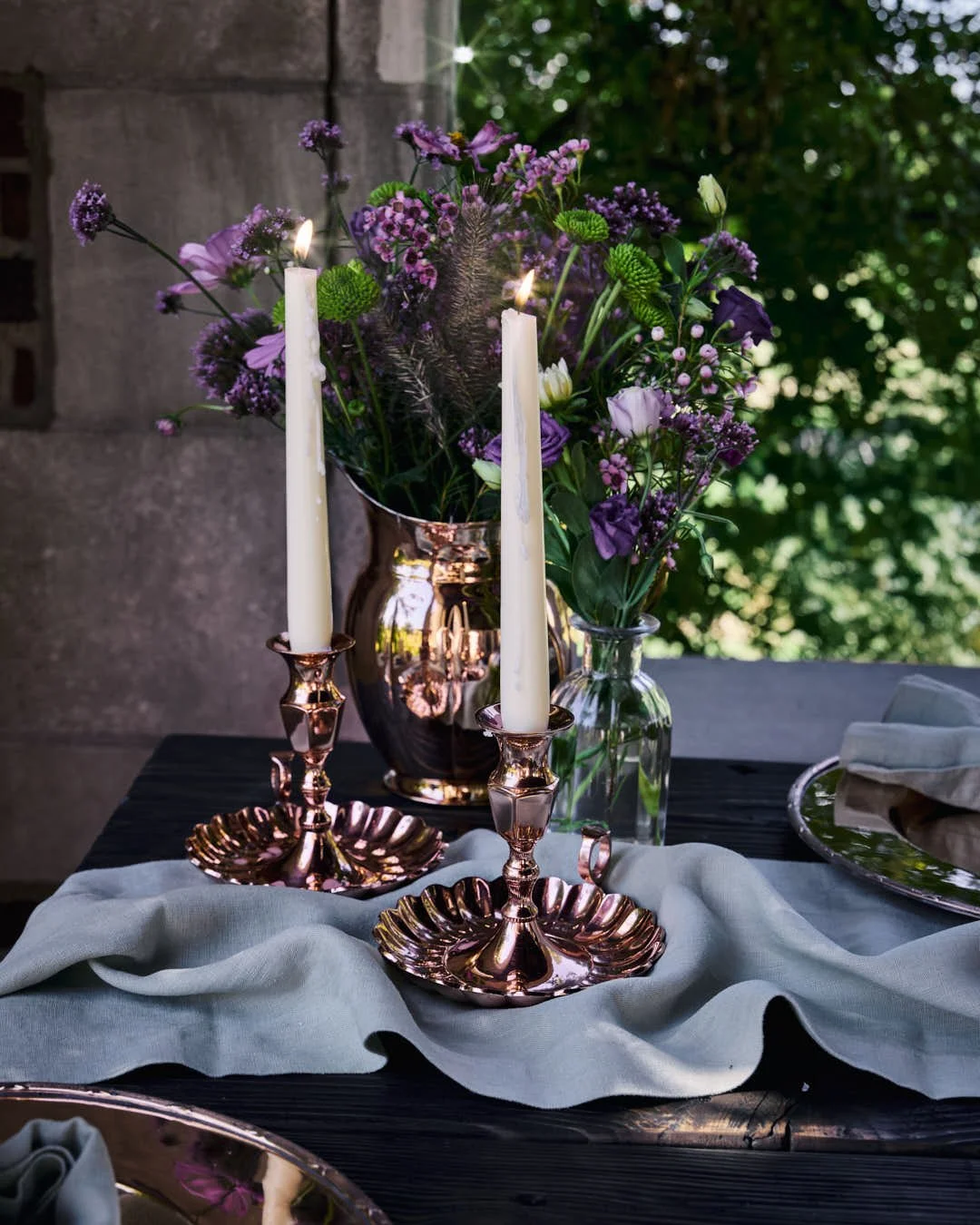
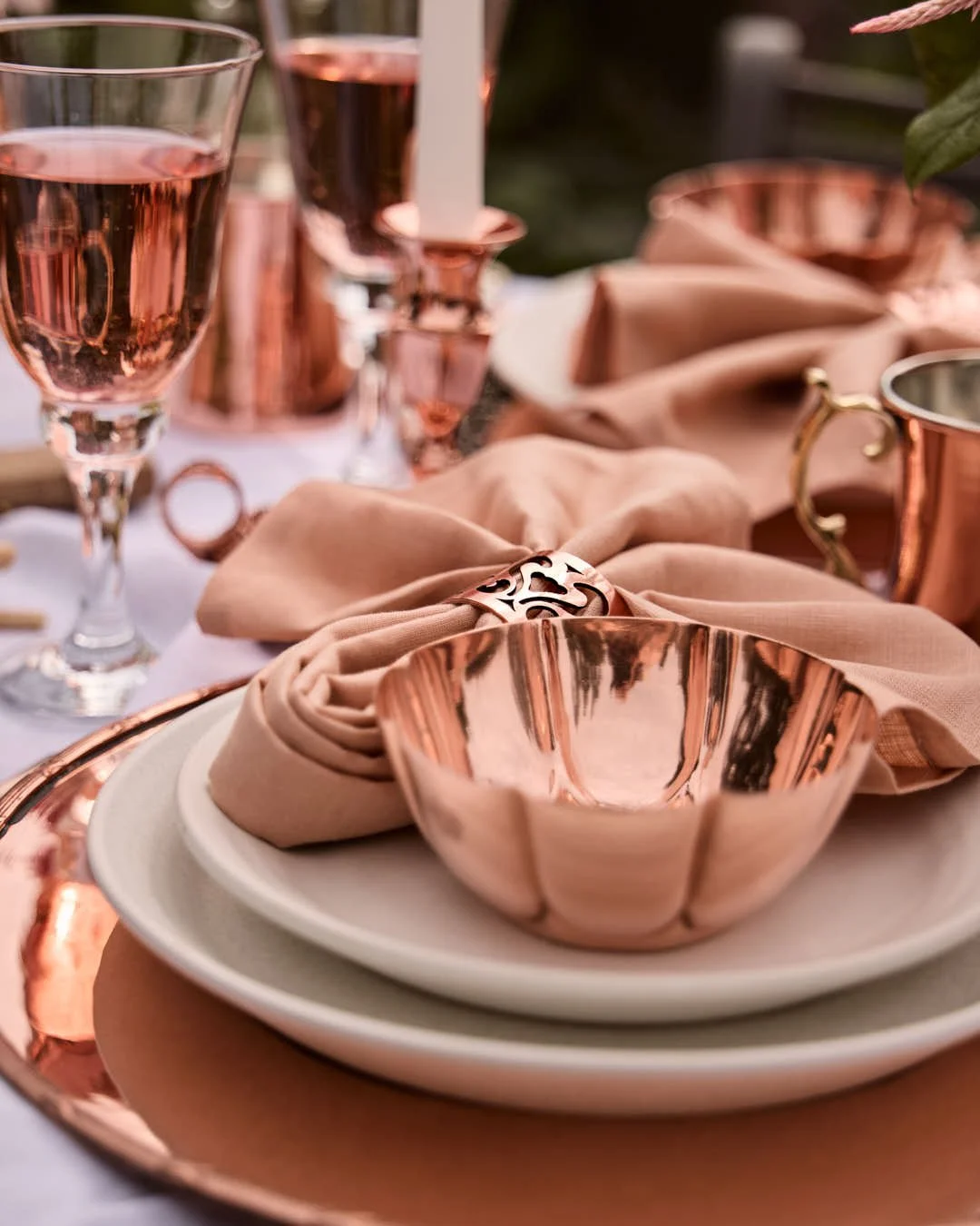
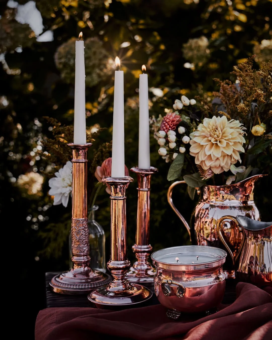
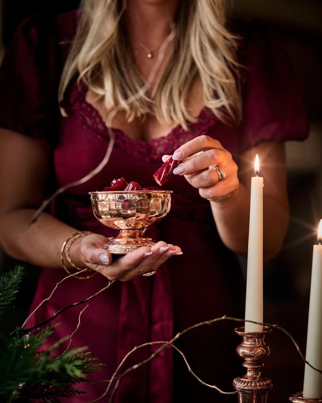
• Winter – Candlelight reflected in polished metal, gatherings drawn close around flickering flames. Quiet, comforting elegance that invites reflection and rest.
The narrative evokes the cycle of creation and continuity, where craftsmanship and seasonality meet in one timeless story.
Mood & Tone
• Romantic and luminous with a natural, timeless elegance.
• Rooted in texture: burnished copper, linen folds, wood grain, and dappled light.
• A blend of refinement and rustic intimacy.
• Emotionally grounded in warmth, artistry, and the beauty of daily ritual.
Emotive Keywords:
Warmth, craft, continuity, nostalgia, celebration, heritage, seasonality, glow.


Visual Style & Composition
• Lighting: Natural, golden, and evocative: soft shadows, glints of sunlight, and reflections that enhance copper’s living patina.
• Colour palette: Seasonal: verdant greens and citrus for spring, sunlit gold and blush for summer, russet and plum for autumn, deep amber and candlelight for winter.
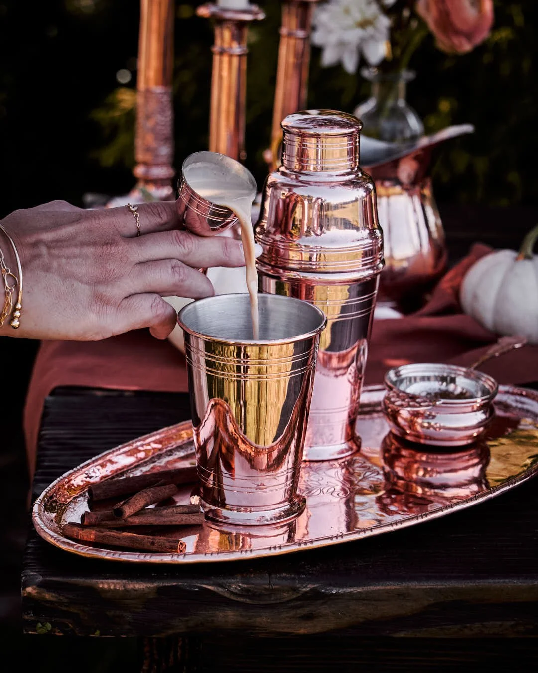
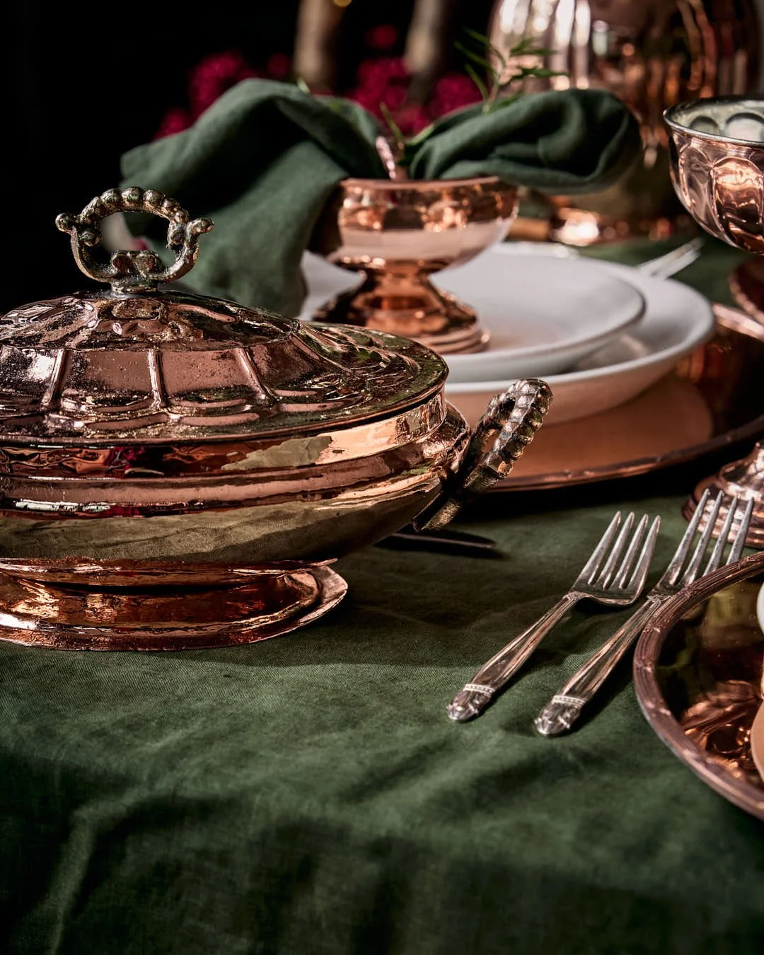
• Texture: Polished, yet organic: the hand-forged rivets, brushed metal, natural linens, fruit skins, and floral blooms tell of touch and time.
• Composition: Intimate and cinematic at the same time.
Layers of depth are created through table styling, organic movement, and the play of light & reflection.
Hero Elements
• Copper Tableware: Reflecting light and season in equal measure, from serving bowls and jugs to trays and candlesticks.
• Seasonal Ingredients: Artichokes, lemons, berries, and blooms: grounding luxury in nature’s simplicity.
• Lifestyle Vignettes: Tables set for slow gatherings; details that suggest presence and storytelling: not of perfection but lived beauty.
• Craftsmanship Details: Rivets, engravings, and handles that anchor each piece in heritage and handwork.


Results
The final images delivered a captivating narrative that emphasised the craftsmanship, versatility, and aesthetic appeal of the
Coppermill kitchenware & barware.
The visual storytelling resonated with an audience seeking products that merge practicality with timeless design, inspiring them to envision these pieces as integral parts of their homes season after season.
Looking for timeless product imagery that tells a story?
Let’s work together
Whether it’s food photography, lifestyle product photography or videography or an Instagram partnership, I’d love to hear more about what you had in mind! Let’s get in touch.
Read all about how working with me feels and looks like here.
For partnership opportunities, please reach out directly to suze@gourmetglow.co.uk